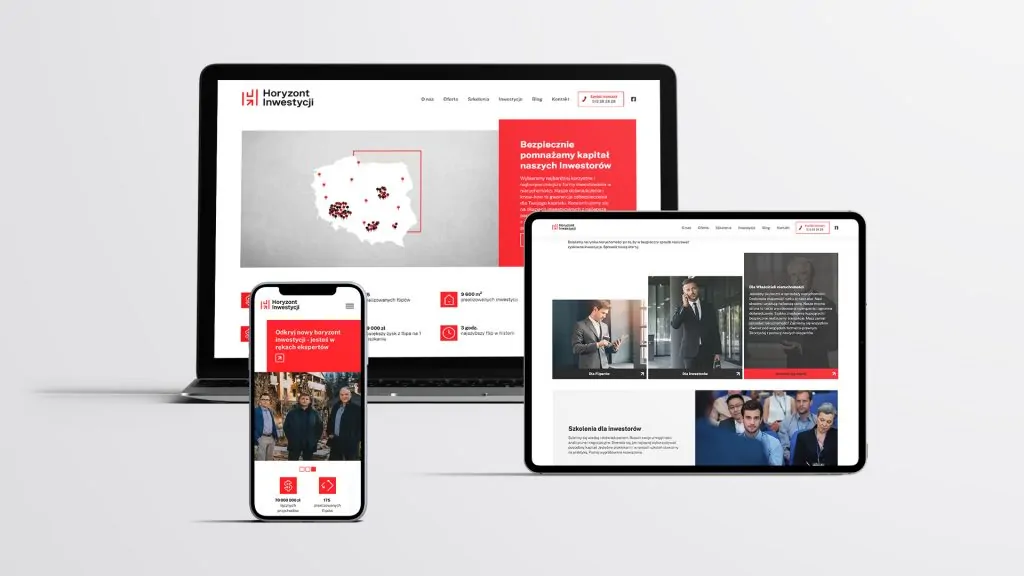
The CTA button works like a magic button, making things just happen. Want more subscribers to your company newsletter? More contest entries? Improve conversion? You won't get it without a proper CTA.
The CTA button, if it were a superhero, could be in the movie "Ultimate Activator." In the first scene, the company managed to gain the attention of the recipient. She convinced a potential customer to her product with killer ad text, great graphics or video. Bravo, but the most difficult thing is yet to come. Now he has to close the sale or convince the recipient to do what is expected of him. The CTA goes into action.
What is the CTA button?
Many companies simply include a CTA button in their ad, such as "sign up", and hope this will be enough to increase conversion rate. Before that, they put a lot of time, energy and money into creating advertisements. Communication strategy it is well thought out. The product is clearly visible on social media, supported by blog articles and email campaigns. Finally, the company calls for action without conviction. And whole engaging advertising campaign it backfires. And it could have been so beautiful. If only the CTA button actually worked.
To avoid failure of the entire marketing campaign, a call to action cannot be "any." It has to be strong, persuasive and effective. The CTA button has two main purposes: to tell someone what to do and to motivate them to do so. Most companies remember the former. They tell people what they should do, but they forget that they need to be made aware of one thing more - why.
Are your clients motivated to act?
Give them a reason to buy from you.
Common CTAs
The CTA button encourages your audience to take action as part of your marketing campaigns. The goal of each of them may be to induce recipients to act differently. Below are some examples of CTAs that are common in marketing.
Sign up. In this type of CTA, the recipient may be invited to sign up for a paid subscription, online course, event - it all depends on the context of the CTAs in the ad or website.
Subscribe. It is a call to action, it is not a purchase obligation. Instead, it invites you to "stay informed." "Subscribe" CTAs are commonly used, for example, in the case of corporate blogs, for which the company wants to gain as many readers as possible.
Try it for free. Many companies are offering a free trial today. This type of CTA button allows people to check the performance of the product / service before deciding if it is worth the money for them.
Find out more. Sometimes all a business wants is to give potential customers a little more information to convince them to buy later.
Join us. A CTA button with such a call will come in handy when a company manages an online community.
All of the above types of CTAs serve a purpose, but their content may vary. Each one target group is different, therefore the messages are different. The CTA button cannot be universal. After all, it is supposed to generate potential customers that the company cares about.
Effective CTA button - 5 tips on how to create one
1. The CTA button must convey a dynamic message. Use a strong verb for action. This is not the time to "beat around the bush" - get straight to the point and tell your audience what you expect from them. If you run an e-commerce store, you can start a CTA with words such as "buy now", "order today." Are you organizing an online conference? You can use the words "sign up" or "take part".
2. Use words that have power. No matter what action is to be taken by the person you are referring to the CTA. To create a strong emotional response in your audience, create emotional summons such as "Get 75% Discount Now!". Emotions are what prompts us to make decisions and move forward. The mere use of an exclamation point (!) Signifies enthusiasm.

3. Create a reason to take action. Let your audience know exactly what will happen when they click the CTA button. Link your call to action with your value proposition. Give your audience something to motivate them, whether it's to save or earn money, to get fit, lose weight, sleep comfort or anything else.
4. Choose a good color for the CTA button. While we've heard a lot about the psychology of color in marketing, the truth is, the CTA button is just meant to be clearly visible. If you put it, for example, against a blue background, it does not have to be blue, and it should not be blue - it is likely to go unnoticed. The color of the call to action button is meant to make the CTA stand out. So that potential customers know immediately where exactly they need to click to take action.
5. Test the CTA button. As with ad text and other marketing content, it's important that your CTAs are effective. How to check? By conducting A / B tests, i.e. comparing two versions of the website, so as to choose the one that better meets the tasks set for it. The tests will help you evaluate which CTAs are generating clicks and which are not. Of course, your choice should be what works best.
Where will the CTA button work?
You can - indeed should - use CTAs in all types of marketing materials and on any platform that your business is doing. This applies not only to PPC ads, but also websites, blogs, newsletters, e-mails, etc. Sometimes a CTA button in the classic sense is not needed - a plain call-to-action text with a hyperlink is enough. However, in the vast majority of cases, clickable buttons bring the greatest benefits.
It has been proven time and time again that this type of CTA button significantly increases conversion rates. One study found that blog texts where CTAs looked like buttons instead of plain text saw a 45% increase in conversion rate.

Advantages of the CTA
What all companies try to do is direct visitors to a landing page. As PR agency we are well aware of this. Where the offer is and all the great products just waiting to be bought. But without a CTA button that directs potential audiences to this place, hardly anyone will discover it. Once visitors land on your site, the call to action is the next step in the conversion process. Basically, the CTA button is supposed to convert visitors into leads and ultimately into customers.
A CTA is a company's business assets that "work" for it on a website 24 hours a day, 7 days a week. At any time, they aim to motivate visitors to take the next step. No company wants visitors to their site to get lost and confused. Therefore, you need to give them directions. Simple and unambiguous, action-oriented.
Are those not enough reasons why the CTA button is an extremely useful tool? If you're not convinced by this, consider that calls to action help measure the effectiveness of a website. Each click can be monitored and allows you to collect important analytical data. What does this mean for the company? It can determine your ROI with the accuracy of the 100%. The question is, how valuable is this to you?

