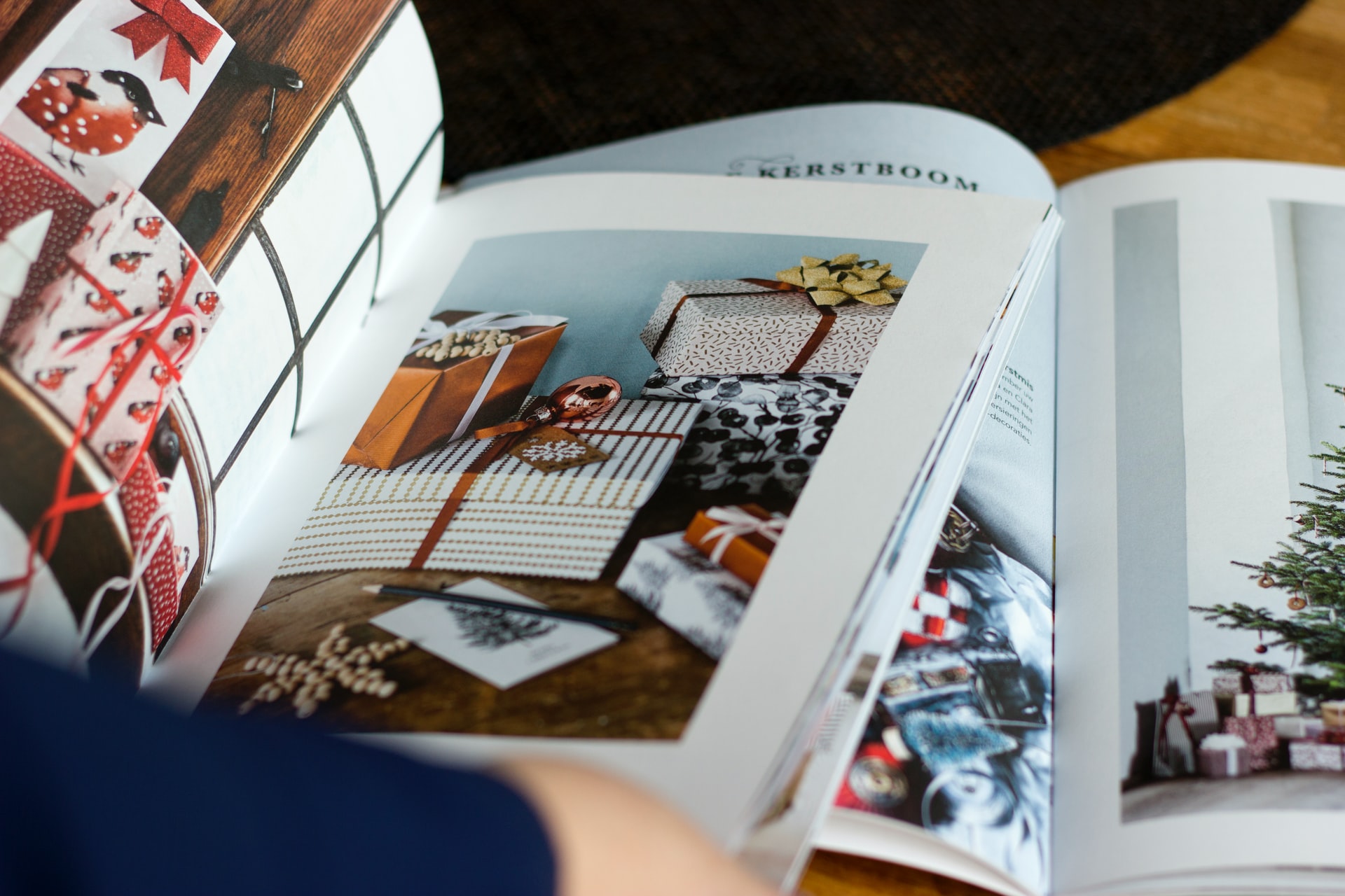
Glossy advertising catalogs and folders on chalk paper are pure prestige. On the other hand, they cost a lot, and nowadays not everyone pays attention to such small things as a catalog. Does the company's image folder still make sense?
Proper brand presentation is the key to success! Today, most of the PR and marketing activities take place on the Internet. However, the traditional form of advertising can also bring benefits. The most interesting printed advertising materials include, among others image folder. The question - how to prepare it?
Image folder - what is it?
The image folder is a professional form of advertising, which is to present the company to individual target groups. It is most often used in the process of acquiring new customers and business partners. It differs from other printed advertising materials (such as brochures or leaflets) in its form. The folder is larger, which makes it possible to include comprehensive information about the company in it. You can broadly describe it, present its goals, values, mission, and also mention the most important projects. How to prepare an attractive folder that potential customers or business partners will be happy to see?
In the middle you can find company data, management board, articles of external specialists, historical materials, product catalog, table of prices and technical details, corporate structure, information about the company's movable and immovable property.
An image folder is actually a concept used by a narrow circle of specialists. People outside the industry know it rather by names such as:
- advertising catalog,
- company catalog,
- company brochures,
- company newsletters,
- company magazines,
- advertising brochure.
So where does the title of this article come from? The main reason why most people order such a catalog is to improve corporate image. Printing or design is a complex process. If you already have such a folder, you can see that the company has not been on the market since yesterday. In addition, it has become commonplace that thick image folders are the domain of prestigious brands (which is directly related to costs - brands from the basic and economy sectors simply cannot afford such expenses).
The most recognizable prints of this type in Poland include H&M catalogs, the Skarb by Rossman magazine and the IKEA catalog. As can be seen from the example of these three companies, an image folder can also add prestige. There are many similar clothing stores, drugstores and interior design stores, but only these stand out with their own cyclical catalog.
IKEA catalogs, which the company used to send out to thousands of Polish homes, were a particularly interesting case. There was a meticulously presented company's offer, designers 'profiles, shops' addresses and a historical outline. Many people started learning about the brand in their childhood from just such a folder. Later, the first purchases were dreamed of. Some people are faithful to the brand for the rest of their lives thanks to the deep trust they built in those days.
The image of your company is to be or not to be in a competitive market.
Start creating it consciously.
Today.
How to prepare an image folder?
The purpose of the image folder is to present all the most important information about the company in an interesting way and thus save it in the minds of the recipients. In order for a folder to fulfill its function effectively, it must be consistent with the visual identification of the brand. It should contain the appropriate colors, characteristic graphic symbols, language suited to the target group as well as other features typical of the brand. The entire style of the folder should match other media used in the company's marketing.
The image folder may take the form of a saddle-sewn brochure or a glued catalog. It can be square, A4 landscape or other format. It is worth using aesthetic and durable chalk paper to prepare the folder.
Inside, there should be high-quality photos and other graphic elements that will add color to the content. Avoid long blocks of text that are unattractive to your readers. The cover also matters. It should arouse interest and, moreover, encourage you to look inside. Both inside and on the cover, additional refinements can be used - such as UV varnish or a special foil.

A carefully designed image folder containing interesting information will be an excellent showcase of the company, useful during fairs, conferences or other industry meetings.
When is it worth investing in a folder and when is it not worth it?
In 2016, the IKEA catalog was printed in 200 million copies and distributed in several dozen countries. However, the catalog released in 2020 was the last one in the company's history. Today, IKEA no longer sees the need to spend such enormous outlays and resources on what can end up in a home trash can. It must be remembered that the recipient today can focus for a much shorter time than a decade ago. It is more and more difficult to expect a person only loosely interested in the brand to spend a few hours studying the image folder. Instead, IKEA focuses on targeted, concise advertising or emotionally moving campaigns on the web.
Is it possible to draw a conclusion from this, whether the era of image folders is over? Not! Still such materials can perform a very important function:
- improve the company's credibility,
- are a pill of knowledge for investors or clients,
- allow you to clearly present the mission or history of the company,
- show that the company has a budget for representation activities.
Currently, however, there is another problem that has certainly contributed to the fact that IKEA no longer produces its image folders. Some audiences may be reluctant to print glossy brochures in high volumes, since the same information can be uploaded for free on the web. Accusations of wasting resources will be strongest in industries related to environmental protection and ecology. There, the only solution would be to print such an image folder on handmade paper with seeds, on recycled paper, etc.
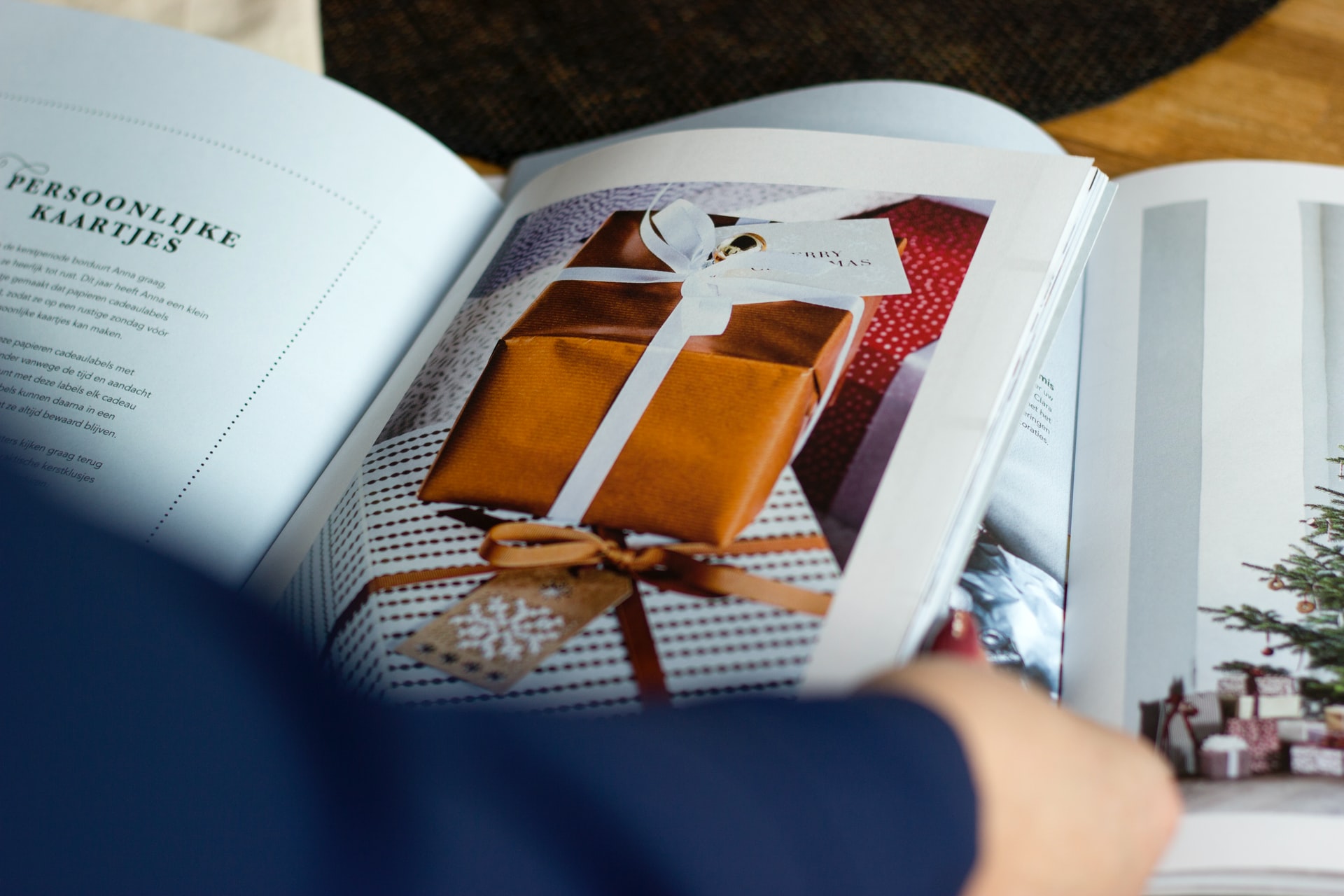
Image folder - circulation and recipients
Taking all this into account, it is not worth investing in too much image folder. Everyone remembers at least one situation when, after a trade fair or other official event, expensive, refined brochures of one of the companies end up practically unopened in the garbage cans. This can leave the investor who has paid for them a heart attack. Therefore, it is not worth giving such company gadgets to everyone.
There is a psychological mechanism by which we value the rare and like to feel special. It is not worth placing, for example, a pile of image folders at the entrance to the plant, or adding them to every letter, employee package or bill. It will be better to give them only to the best customers or the most promising contractors who will appreciate a tasteful gift. In this case, quality is definitely more important than quantity. Instead of a mass folder similar to thousands of others, it is worth printing a few dozen or several hundred pieces of a folder with gilding, embossing, holographic and spatial elements or with a beautiful overlap.
How to use it creatively?
Image folder it can also be part of the starter pack for people who start working in a given company. Employer branding is consistent communication directed at the employee: at the level of graphics, corporate culture or HR policy, and the image folder will complement these strategies. It may contain employee histories or a promotion structure tree - then the employee will find real value in it.
A specific type of an image folder is a catalog in which the form or content itself is an advertisement of the company's craftsmanship. An example is a paper mill catalog, in which each page is printed on a different paper, or a graphic studio folder, where typographic or graphic elements used in the catalog constitute a presentation in itself. The printing house can present its technology through an elaborate cover shape or strong gluing, and the perfume manufacturer can order a catalog with fragrant pages. In this way, it is possible to significantly influence the imagination of the recipient who perceives the catalog with all his senses.
Design and implementation of an image folder
When thinking about creating an image folder, many business owners only consider the cost of paper and printing. And it's not about duplicating company materials! Only creating an interesting, up-to-date project from scratch can make the recipients actually pay attention to it. In graphics department We create Commplace:
- logo design,
- photo suggestions,
- colors and themes,
- composition of the project,
- typography,
- branding.
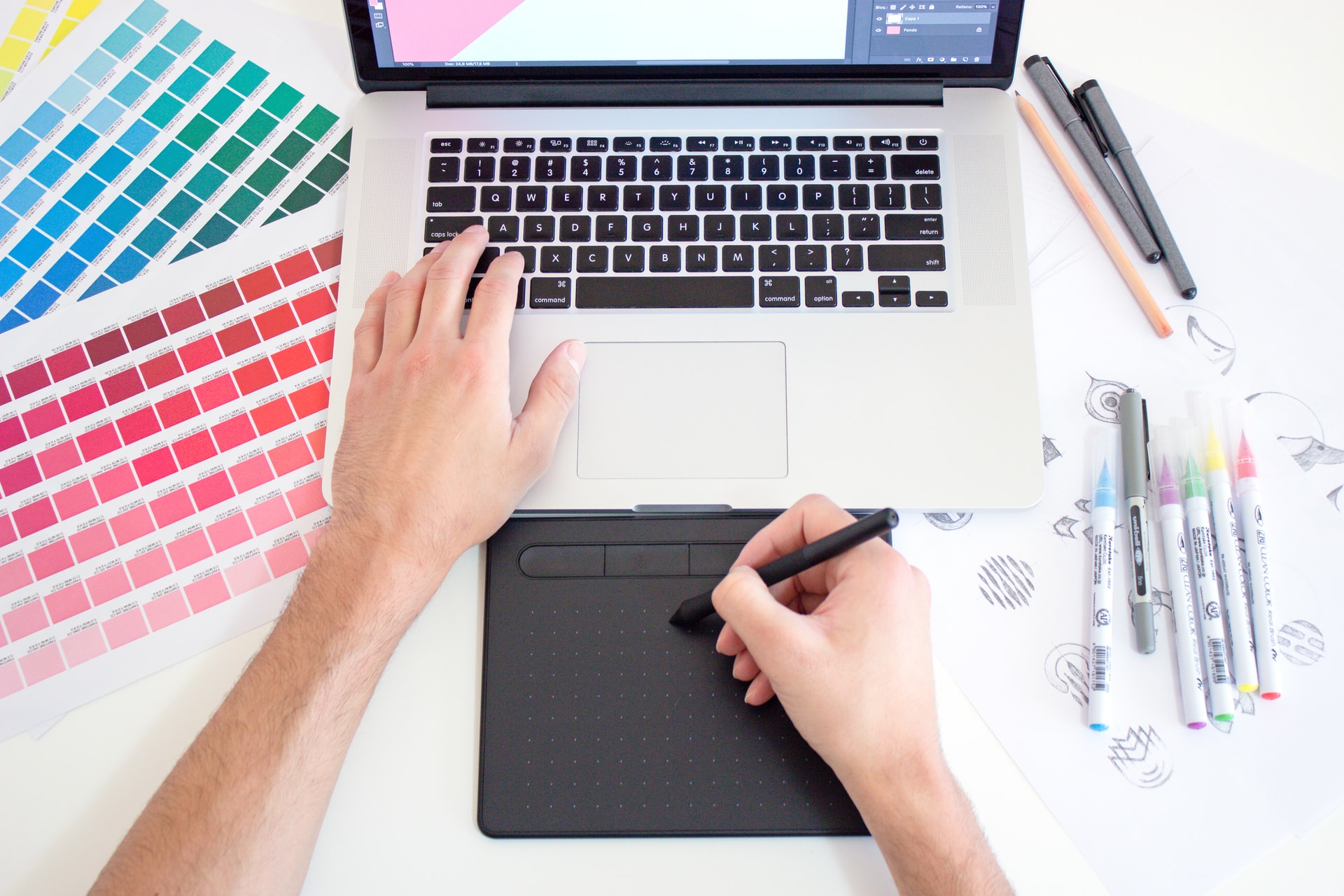
You can also commission us marketing audit graphic materials that are already used in the company to find out what can be used and what would be better to work on. Look brand rebranding on the example of MSM Mońkawhich we did at Commplace.
On what paper to print a company catalog?
The next stage is the commissioning of copywriting for the project. It's not about the slogans themselves. It's a good idea to implement unique content in the folder. This can be interview with the president, opinions of contractors or colorfully described history of creating new products. It is worth employing a specialist who will supervise the collection and editing of such materials.
First of all, the image folder is associated with expensive paper. At the design stage, commissioners pay little attention to this issue. Sometimes they recommend choosing the "most expensive" paper as a sign of generosity and prestige, and this is not the point. Not only the impression, but also the functional aspects will depend on the paper. Catalogs made of thick, chalky paper are simply very heavy. The pages are difficult to open, and the content from the catalog sewing place cannot be read.
Before printing, it is worthwhile to personally touch the selected paper, compare several types, and it is best to order a test print. If the paper is light and pleasant to the touch, it will be possible to remove the image folder from the shelf at any time and quickly indicate important information or a photo to the contractor. A folder that not only looks good, but is also in use, does not get dust in the warehouse, is "alive" - this is probably the dream of anyone who undertakes such an investment as its printing.
We invite you to visit Commplace to discuss the design of your image folder.
