Definition
The home page, also called the home page, is the first page of the entire website that the user sees after clicking on the website address. The home page gives us a preview of what's on the entire site, already in an extended version. Through the main page, users go to its subsequent subpages. Therefore, it should contain all the links needed for further effective navigation.
Home page – interesting facts
The home page is a very special place for any website. This is where we will find the most important information, often also news and information about promotions or other important events related to the topic of the website.
The home page is important for the entire website, so its appearance and content should be carefully considered at the design stage. In the case of the appearance of the home page, the first visual impression it will make on visitors is very important. It should be presented in such a way that every visitor wants to stay there longer and learn more about its content. Therefore, the home page should not be too cluttered. Too much information contained in one place may have negative effects and instead of arousing interest, it may cause the visitor to quickly leave the website.
Home page – the most important information
The home page, as already mentioned, is the most important element of every website. The primary task of the home page is to quickly and clearly show visitors what they can expect from the entire content of the website. The most important information should therefore be at the top - this way it will be quickly found by users who are looking for it. The company logo and menu should be placed in a central, visible place on the home page. Other important elements that must be included on the home page are the company information section, the Hero section, i.e. the most important message addressed to the recipient, the CTA section, i.e. call to action (call to action) and additional information section.
The home page should exude simplicity and minimalism. The home page should only contain specific information, presented concisely for even better readability. It is good practice to avoid unnecessary and lengthy content. The key is a clear layout and ease of navigation, which allows users to move smoothly around the website. To increase accessibility, it's a good idea to divide the content on your home page into short, horizontal sections. This is especially important for users who are looking for specific information and do not want to get lost in the thicket of irrelevant content. Headings are helpful elements that help systematize the structure of the content.
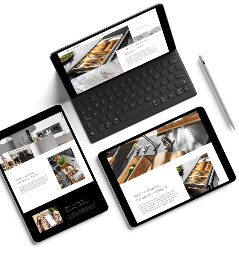
The home page must be responsive. What does it mean? Website responsiveness is the ability to quickly adapt to different screen resolutions on which it is opened. Thanks to responsiveness, the home page looks equally good both on a large computer screen and on a smaller screen of a mobile phone or other mobile device. A key facilitation in this context is centering the content on the home page, which is necessary for the effective presentation of information on mobile devices.
Summary
The home page is the first version of the website that the user sees, so it is so important that it is legible, clear and allows for a quick assessment of its usefulness. The home page should provide the user with quick answers to basic questions, hence the importance of a clear layout and valuable content. Mostly websites you can see a similar structure, which affects the ease of navigation. When it comes to your home page, this consistency becomes especially crucial. Functionality and logical layout do not require any additional thought effort from visitors. Instead, they enable intuitive navigation of the website, which is of great importance for user experience, i.e. positive user experiences.
Related entries:
Marketing plan, image creation, brand management, marketing planning, image creation, customer acquisition, sales audit, branding activities, creating a company brand, image creation