Treść główna
Key data
- 6 version of the logotype and logo
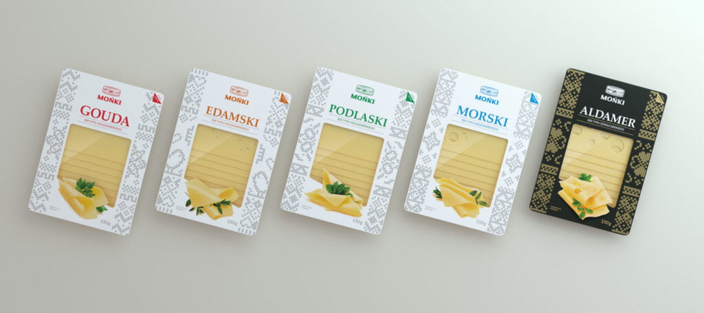
- 5 version of the packaging of the sliced cheese line and collective cartons
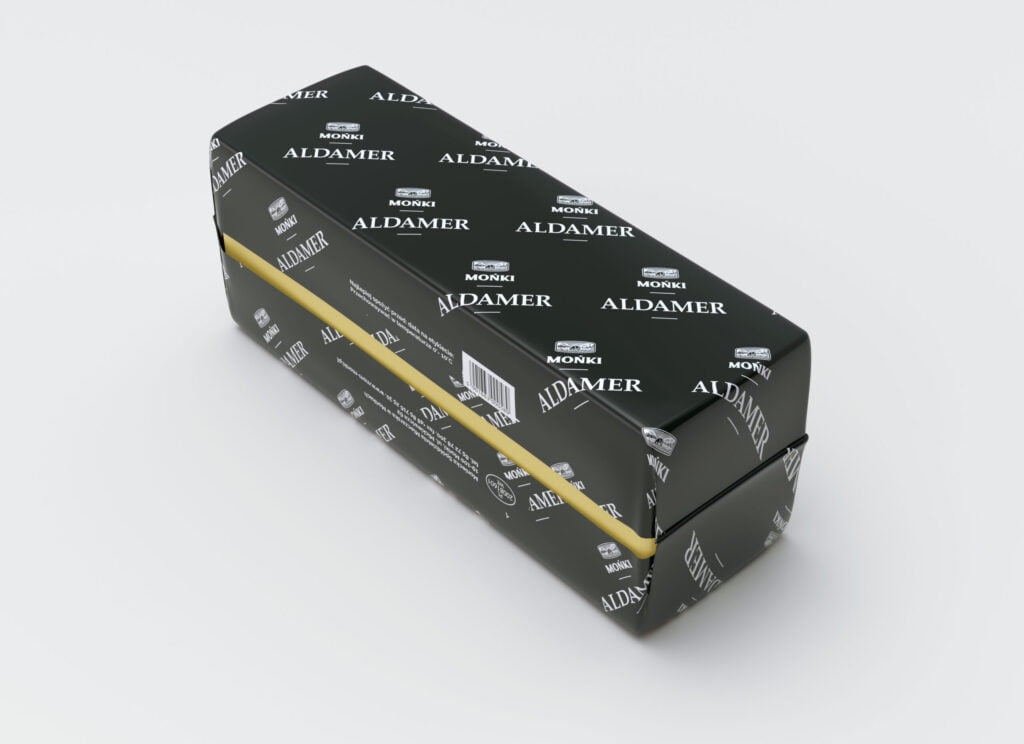
- 7 block version of the cheese line packaging
- Download Case study
Customer story
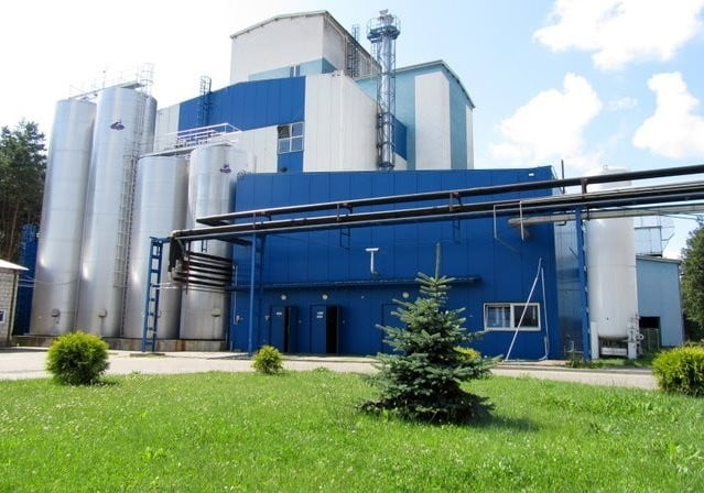
The Moniecka Dairy Cooperative in Mońki is one of the most modern dairy plants in Poland. It was established on May 1, 1972 as a result of the merger of the District Dairy Cooperative in Dolistów and the District Dairy Cooperative in Krypno. MSM specializes in the production of Dutch and Swiss ripening cheeses, extra butter and powdered products: powdered whey and periodically skimmed milk powder.
Production at MSM in Mońki is carried out with the use of the latest technologies. Control at every stage of production ensures that the products are of the highest quality, which is guaranteed by the Company Code of Good Manufacturing Practice / Good Hygienic Practice GMP / GHP and the HACCP System.
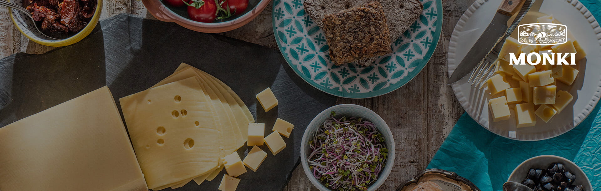
Brand rebranding - refreshing the logo and a new version of packaging designs is a step towards strengthening the current position on the dairy products market and modernizing the brand. The projects will present a modern approach to the tradition that has been promoted for years by the cheese producer (including the slogan "Tradition of taste from the Biebrza Valley").
BUSINESS OBJECTIVES
Strengthening the market position of the MSM Mońki brand by creating adequate branding (brand rebranding: logo and product packaging design).
Increased interest in the brand by potential business partners and individual customers.
Solution
SOLUTION
Design and implementation of a new graphic design (product packaging design) and logo rebranding, so that all visual communication is consistent with the image of the Dairy Cooperative
a subject who moves with the times, but remembers about the strong foundations to which he has been faithful for years.
Brand rebranding - refreshed logo
The refreshed MSM Mońka logo consists of 2 elements: an illustration and a logotype. The illustration shows a cow grazing in a meadow. Thanks to it, the recipient is introduced to the wider context of the brand, whose products are natural and produced according to the traditional recipes from the Podlasie region. On the other hand, the logotype, based on two-element lettering with delicate serifs, is distinguished by a strong and stable character, while remaining legible for the recipient. The logotype was drawn from scratch and is not based on a ready-made font, which gives it an individual, unique style. The whole fits perfectly with the values of the MSM Mońki brand.
Brand rebranding - product packaging design based on the example of a cheese line in slices, blocks and collective packaging
The new packaging presents a modern approach to the tradition that has been promoted by MSM Mońki for years. The packaging of each type of cheese is distinguished by its color, but also a dedicated pattern visible on the sides. In the new packaging of cheese, the existing solution was used, which allows them to be closed and opened multiple times, which was reflected in the graphic design
The packaging designs for the block of cheese lines are each time matched to the product category. They are distinguished by the color and the clearly visible name of the cheese. The whole is complemented by the refreshed logo of the MSM Mońki brand. The packaging is consistent with the main goal of the brand rebranding - presenting a modern approach to the values of MSM Mońki ..
The collective carton designs were created in accordance with the guidelines used throughout the rebranding process. The refreshed logo was each time color-matched to the type of cheese. The whole thing is consistent with the brand image and other elements of visual identification.
Products used
Marketing audit
Marketing audit - analysis of communication methods and marketing expenses
Find out more