Treść główna
Key data
- 5 new logos for the client's company and four of its brands
- 44% of consumers decide to buy a new product based on the appearance of its packaging
- 66% of consumers believe that the appearance of the packaging influences the assessment of the quality of the packaged product
- Download Case study
Customer story
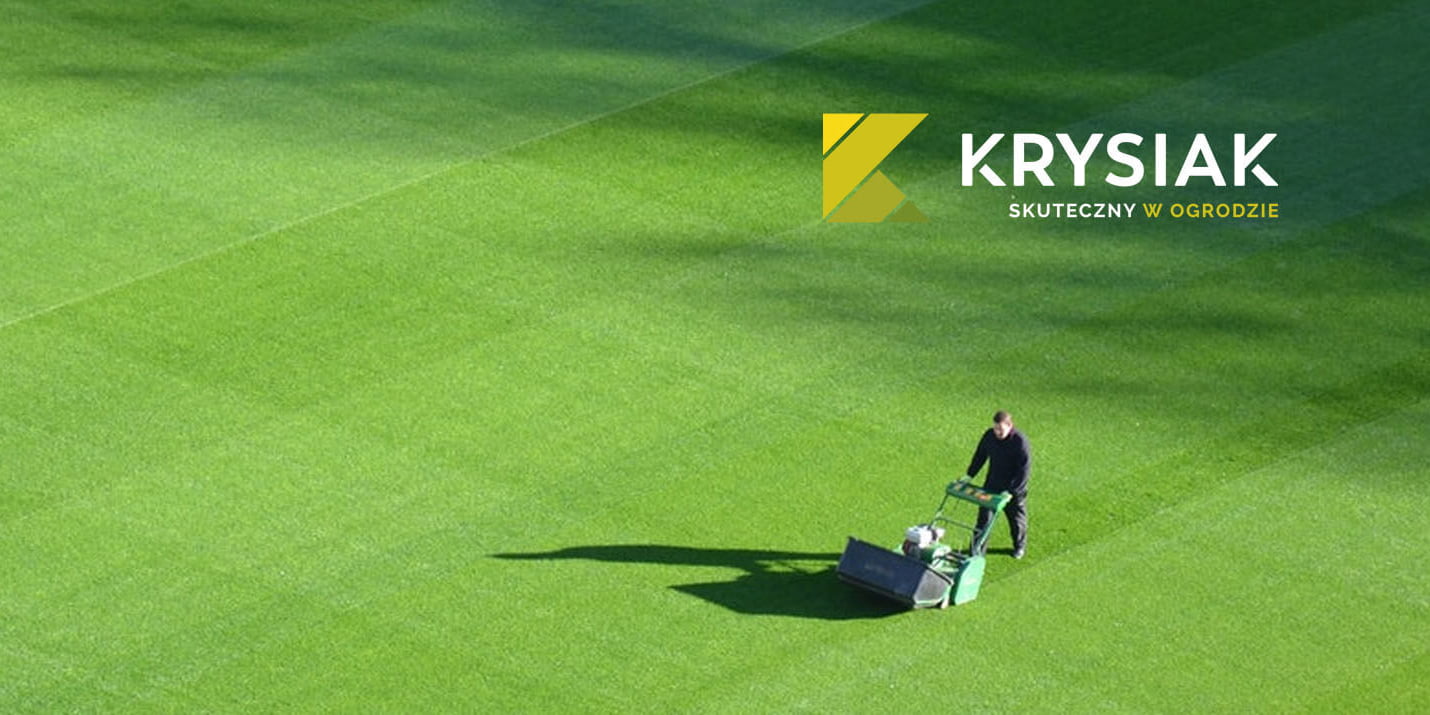
During 30 years of dynamic development, the family business has turned into a company with a recognized reputation in the horticulture industry.
Automation increasingly supports the dynamic development of the organization. The style of management and the space of the enterprise are changing, the network of business partners and market expectations are growing.
The Krysiak company begins to display its own brand and four consumer brands. These, according to the company's idea, are to make work in the garden effective.
The garden is a place where family ties are nurtured. Rebranding is the essence of all the changes taking place in the family business.

BUSINESS OBJECTIVES
The company needed new branding, adequate to its position on the market.
Emphasizing the value of an effective family business, and at the same time distinguishing consumer brands from the competition.
Solution
SOLUTION
Rebranding with the implementation of a new communication strategy. Communication of effectiveness that we want to achieve by using devices in the garden.
Behind the wide changes of visual identification - logo, new product packaging, refreshment of the showroom - there is a consistent message communicating freshness and precision of operation.
At the same time, we focus on respect for family traditions and attachment to the Polish consumer. The company focuses on a strong emotional message.
The new slogan - "Effective in the garden" - emphasizes the advantages of using devices that make it possible to create a garden - a place of relaxation where you spend time with your loved ones.
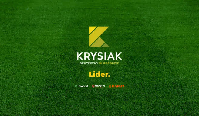
Krysiak brand rebranding
The simplicity and harmony of the new company logo communicates the effectiveness and precision of the effect. Sharp, geometric forms convey to the user a simple message about the quality and effectiveness of the devices, without unnecessary words.
Green stripes refer directly to the garden and a perfectly trimmed lawn, communicating order and harmony. The colors of the graphic symbol - the letter "K" refers directly to the associations with the garden and builds the awareness of the Krysiak brand.
The green "K" is an individual graphic symbol that can function separately in the second stage of rebranding as a symbol and brand signature.
Rebranding - Handy, Leader, Favorite and new Favorite Pro
Handy is functionality. A sign arranged in a legible hand symbol is a double message.
It clearly corresponds to the literal name "Handy" as well as its semantic meaning - communicating the convenience and simplicity of use, as well as the dynamics reflected in the lively colors of the brand.
The Handy brand mark consists of two basic elements. The first is a signet ring. The second is a logotype that was created on the basis of a sans-serif typeface.
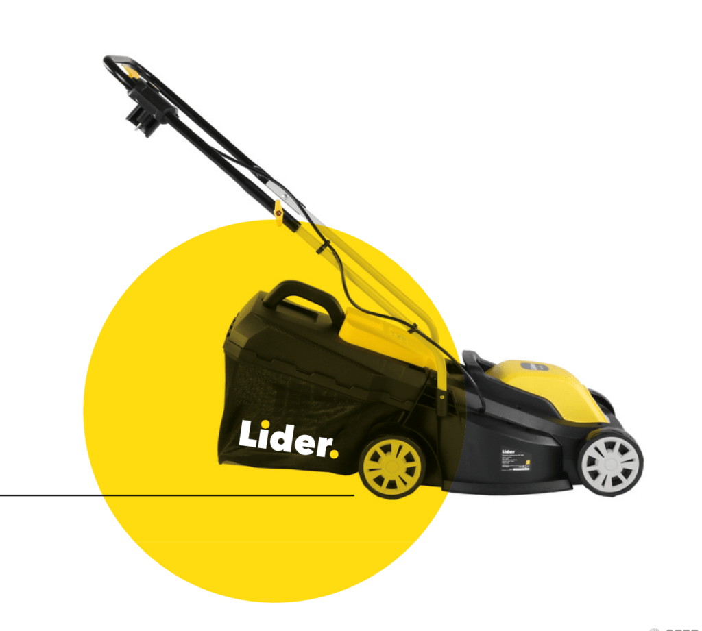
The Lider logo is movement and dynamism expressed through a composition referring to the shape of the mower. The characteristic front wheel captured by adding a dot at the end of the word brings direct associations.
This dot has an additional symbolic value in combination with the brand name. He says that there is no one in front of the Leader, because there is only "leader and period".
The leader is always "first in the garden".
The Faworyt logo takes various forms dedicated to sub-brands representing one of two product groups. The signs are sufficiently legible and consistent so that there is no doubt that they represent one brand. At the same time, each of them is characteristic enough to communicate completely different values of the sub-brands.
The standard line logo is ecology. Calm green is associated with relaxing work in the garden.
Professional line logo for dynamism. The recipient is to use PROfessional products intended for fast-living, self-confident users.
Products used
Marketing audit
Marketing audit - analysis of communication methods and marketing expenses
Find out moreCommunication strategy
Internet communication strategy - development and implementation
Find out morePlace of graphics
7 out of 10 respondents admit that they have a better return on investment when they add graphics to their content. Why? Be expressive and recognizable. Perhaps the time has come for rebranding. Find out moreGood to know:
What is rebranding?
Rebranding is the process of changing the image and strategy of a brand, which aims to increase its attractiveness to customers and improve its position on the market. It involves, for example, a new logo, a change in image or communication style. Nowadays, many companies decide to rebrand in order to adapt to changing customer preferences and improve their reputation. However, there are risks associated with this process, such as loss of brand recognition or inappropriate selection of a new strategy. Therefore, before deciding on rebranding, you should carefully analyze the situation and consult with professionals.
What is rebranding?
Rebranding is a process through which each company can "refresh" its brand to better respond to the needs of the market. This means changing the appearance of the logo, website, packaging or marketing strategy. However, it's not just about color or font. Rebranding is also an opportunity to redefine the company's values and mission, which has a positive impact on customer relations and brand perception on the market.
What is cryptocurrency rebranding?
Cryptocurrency rebranding is the process of changing the image of a given digital currency. This may be related to a new name, logotype, visualization or change of goals. The purpose of rebranding is usually to attract new users and increase the value of a given digital currency. This is a kind of marketing procedure that allows you to introduce a certain dose of freshness and innovation. However, for rebranding to be effective, it must be well thought out and well planned. This involves the need to understand the cryptocurrency market and the preferences of potential users. Any changes should also be communicated clearly to avoid confusion and unnecessary fear.
How to prepare for rebranding?
Rebranding to change the image of a company can be a demanding task. It requires thinking, planning and creativity. In addition, this process can be a catalyst for growth or decline, so proper preparation is important. Researching the target market and competitors, identifying the essence of the brand and creating a solid visual identity are just a few ways to achieve success. By taking the time to carefully plan and execute your rebranding strategy, you will be able to create a strong, resonant identity that truly reflects your company and values. Remember that successful rebranding requires a clear vision, perseverance and patience. It is best to entrust this task to professionals.
What tools to use for rebranding?
Rebranding, i.e. changing the brand image, is a process that requires proper preparation. The right tools can greatly facilitate and streamline the entire procedure. So what is worth using? First of all, it is worth reaching for tools that analyze the activities of competitors and company branding. Project management tools are also invaluable during rebranding, as they enable better organization of work and achievement of intended goals. It is also worth paying attention to the appropriate design tools that will allow you to create a visually consistent brand identity. Well-chosen tools are the basis for successful rebranding. What should they be and how to use them? Let the experts decide on this.