Treść główna
Key data
- 9 visualization of the use of the logotype on various media
- 5 color versions of the logotype
- 1 market leader
- Download Case study
Customer story
The Etisoft company has been operating on the market for over 25 years. The direction in which Etisoft is going is related to both development, which will allow to maintain the position of a modern and responsible supplier of labels, and technologically advanced products in the field of process automation ("From labels to Industry 4.0").
In addition, in the first quarter of 2020, the brand launched an innovation on a European scale - self-adhesive disposable masks, as well as additional products from the Etisoft Personal Protection class - visors for adults and visors for children.
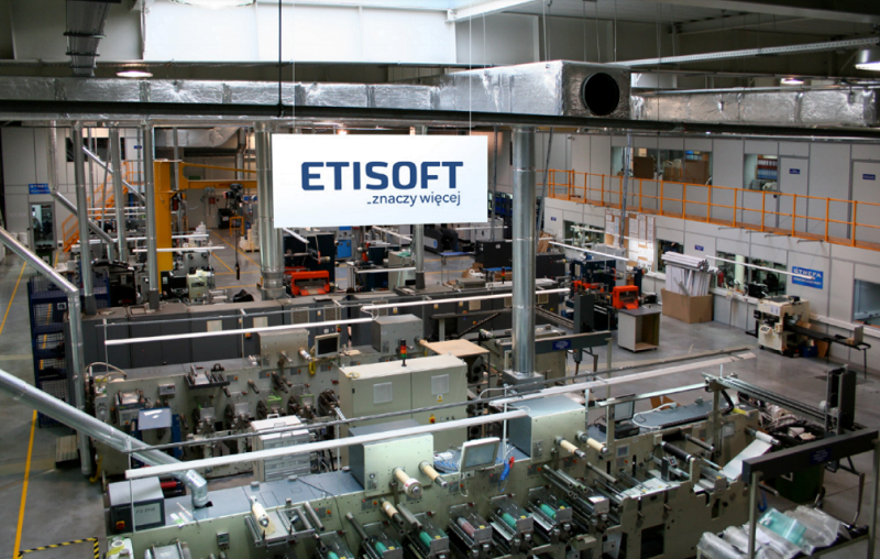
The greatest value of Etisoft is a team of over 400 qualified employees. Etisoft employs specialists who are constantly looking for new solutions, materials and raw materials; experts dealing with marking and automatic identification systems, software and service as well as production technologists.
Currently, the Etisoft brand is a market leader in its industry. It is constantly expanding the portfolio of products and services offered, operating both in the Polish and foreign arena.

BUSINESS OBJECTIVES
Increasing the value of the Etisoft group.
Building a strong, recognizable ETISOFT brand and maintaining the image of a dynamic company employing professionals.
Increased interest in the brand by potential business partners and customers (both domestic and foreign).
Strengthening the company's position on foreign markets.
Solution
SOLUTION
Brand rebranding, which consisted of the design and implementation of a new logo, so that all visual communication was consistent with the desired Etisoft image
a modern brand that creates trends, which is a leader in its field.

PR agency
brand rebranding - refreshed logo
Carrying out the logo lifting was a modernization and strengthening of the entire image of ETISOFT. The refreshed logo has been designed to facilitate the brand's expansion into new markets, while emphasizing its professionalism and innovation. The new logo will also allow the brand to stand out against the background of foreign competition.
"ETISOFT means more"
An important complement to the logo was the multifaceted claim "ETISOFT it means more". This non-obvious pun attracts the viewer's attention, engaging him in the search for semantic and allegorical meanings.
The presented claim allows, on the one hand, a literal identification of the company's main activities (from labels), as well as a metaphorical, but compressed approach to all the most important strengths of the brand - rich experience, dynamism and original solutions of the R&D department. As the brand operates both on the Polish and foreign markets, both Polish and English additions to the claim were proposed.
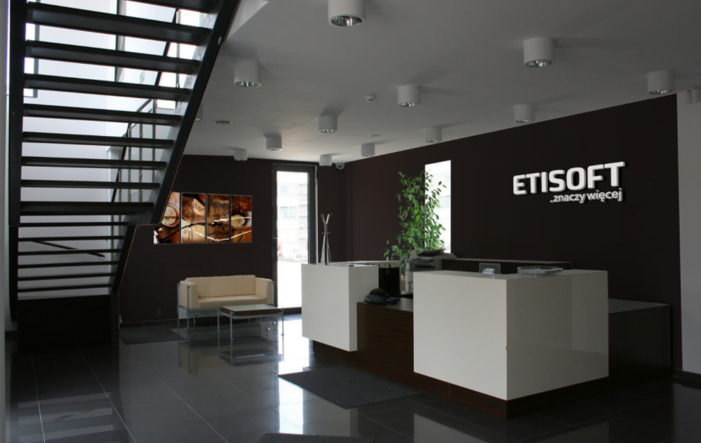
Moreover, Commplace experts prepared a comprehensive plan and schedule for the implementation of the new visual identity, which was systematically implemented. The refreshed logo was used on marketing materials of the Etisoft brand - business cards, gadgets, sales offers, as well as in the company's newsletter - Nawoj.

Products used
Communication strategy
Internet communication strategy - development and implementation
Find out moreMarketing audit
Marketing audit - analysis of communication methods and marketing expenses
Find out more