Treść główna

Key data
- 3 Horyzont Inwestycji brand distinguishing features included in branding
- 2 guiding colors supporting brand communication
- 20 examples of the use of new branding in visualizations
- Download Case study
Customer story
Horyzont Inwestycji is a brand that was created thanks to the consolidation of knowledge and experience of three experts. The synergy effect is complemented by the professionalism of teams cooperating with the company - professionals on the real estate market. The advantage over sole proprietorships or family companies results from the accumulation of expert knowledge in one entity. This solid foundation is a guarantee of financial success for investors and cooperating with flippers, sourcers and intermediaries.
The services offered by the brand include: real estate investments, flips and land investments. The brand operates in several cities. Experts support projects in Kraków, Warsaw, Poznań, Szczecin and Wrocław. Thanks to its great commitment, the company is now able to carry out as many as 40 investments at the same time, which is a great success and makes it strong.
Business goals
Planned effects of our activities:
Building a strong, consolidated brand of Horyzont Inwestycji.
Increase in brand recognition compared to competing brands.
Distinguishing the brand and strengthening the image of its experts.
Increasing the perceived value of the Horyzont Inwestycji brand.
Increased interest in investment products and cooperation with the brand.
Solution
Solution:
Branding system supporting the consolidation of activities
Our tasks included designing and implementing a proprietary branding and logo standardization system. The key aspect was to include brand distinguishing features in them, consistent with the communication strategy. As a result, each of the visual materials created referred to the leitmotif and slogans: success, energy, stability.
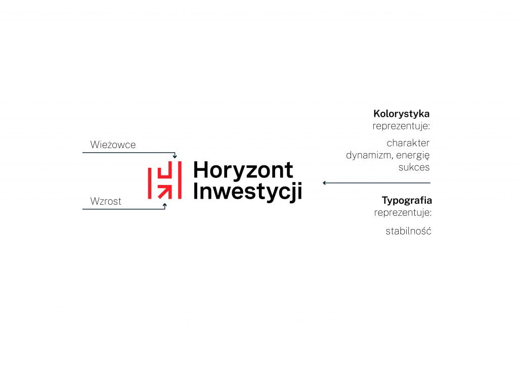
Brand branding - logo symbolism
The signet ring used symbolizes two elements. The first is the growth represented by an arrow and two columns. One is higher than the other, which corresponds to the charts of investments. The second symbol is the buildings, and more precisely the skyscrapers from which the signet ring in the form of the letter "H" was made. The selected typography shows stability and a strong character. The logo uses a combination of classic black with a modern shade of red. The selected colors symbolize dynamism, energy and success. The standardization also includes achromatic (black and white) versions of the logo, which can be used on various types of materials. The achromatic logo is the basic variant of the logo that should be used in the materials.
Standardization of the brand design system
Black was supported by grays and reds. Black, a classic color, represents strength and elegance. Thanks to the combination with neutral grays, it allows for consistent blending with various elements. In the case of complementary colors, a color palette was used, which should be used to create information materials for the presentation of data - charts, diagrams, infographics.
On the so-called visual constants consist of two graphic elements. First of all, the arrow that always points to the upper right corner symbolizes growth. It may indicate important content, such as the expected rate of return on investment. The arrow can also be used to create interesting patterns. The second element are the columns from which the brand's signet is made. The columns don't have to come together, but they can form modules. The column can be used as a place to insert a photo or text. Both elements can appear together, but due to their strength they can constitute a single distinguishing element.
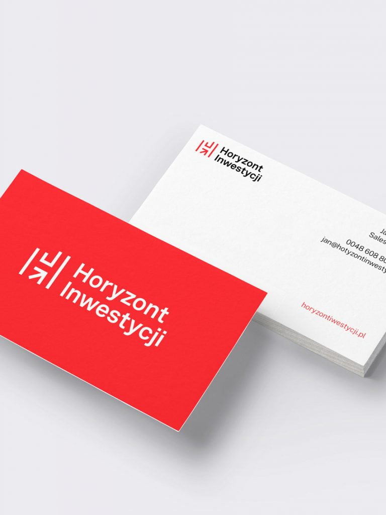
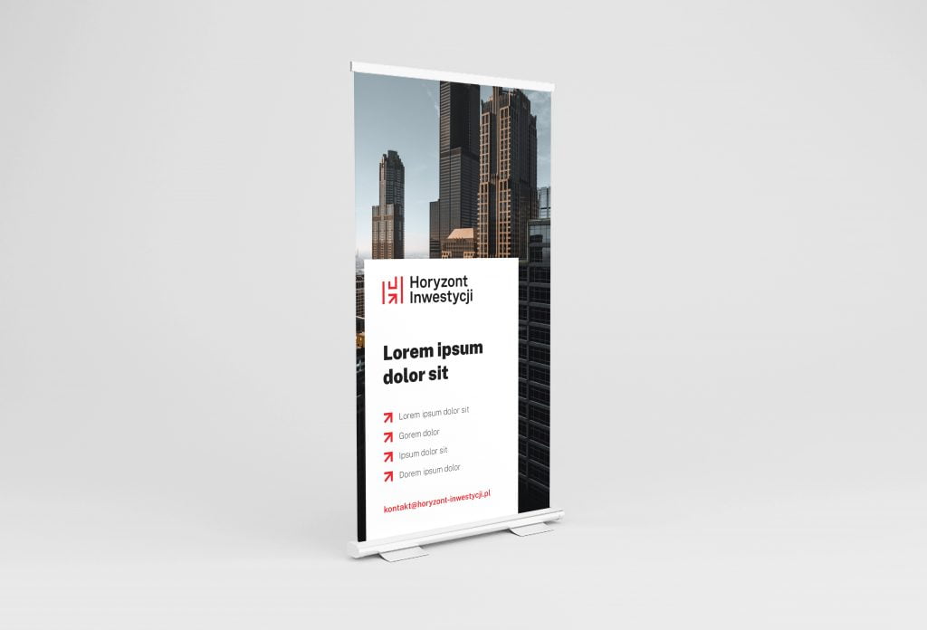
In each of the implemented branding projects, one of the important elements is the creation of visualizations that show the effect on individual promotional or information materials. These include: business cards, brochures, letterhead, advertising banners, e-mail footers or company presentations. The presented examples constitute a coherent whole, presenting the most important distinguishing features of the brand.